5 innovative web design trends for 2023
Web designers need to think more broadly about the factors that influence user experiences, considering both the positive and bad aspects of those factors. Only then can they develop more engaging digital experiences. The following trends in web design for 2023 will be helpful in addressing these more substantial issues:
1. Hoverable iconography
One of the main goals of web design is to create user interfaces that are simple for anybody to use. However, the usage of numerous shortcuts in web design, especially when it comes to iconography, may present difficulties for some users and restrict accessibility.
For certain imagery, the meanings are clear. For instance, the usage of icons in website headers is now so common that most, if not all, visitors are aware of what they do and what happens when they click on them.
For instance, the BeBiker 4 website has three icons on the left for: Account, Search, and Shopping bag/cart.
Users won’t be confused about how to use this portion of a website header as long as the same iconography is used on all of the websites.
You must, however, take into account the diversity of your clientele and the unique ways in which each individual may perceive specific imagery that is less usually employed. In 2023, web designers will begin implementing hover-triggered help text above symbols on websites in an effort to increase user comfort when engaging with iconography on websites.
You can view an example of this pattern on the BeJeweler 2 website:
In addition to appearing when customers click on product icons, help language can also be seen when they hover over variant swatches. This eliminates all room for interpretation and ensures that all users can engage with website content moving forward in a secure manner.
2. Added social evidence
Trust is an essential component in the formation of relationships with clients, whether they are professional or personal.
Because customers’ websites are generally the first place they interact with brands, any efforts to develop trust must start there. This will be accomplished by web designers in 2023 through the use of social evidence and trust indicators.
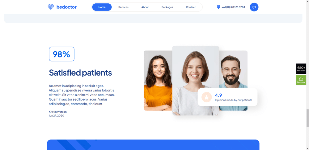
There are many other applications for these trust-builders that can be deployed on websites. The website for BeDoctor takes one of the most popular and effective techniques to resolving this issue by having not only a page on the site but also a section on the home page containing actual testimonials and/or evaluations:
This particular example shows three types of content that could help to increase website users’ trust:
• A client testimonial;
• An average customer rating that links to a review site like Google or Yelp;
• An overall customer satisfaction score
If your company is one of them, it may still be too soon to have accumulated a significant amount of social proof; if this is the case, your website should avoid making any claims that are considered to be boastful. In this scenario, trust marks are the most sensible option.
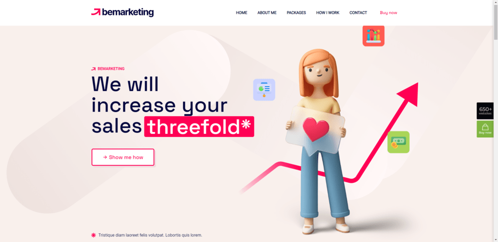
The use of security seals, such as a symbol located next to the “Checkout” button, provides customers with the peace of mind that their financial transactions will be safe. BeMarketing 2 demonstrates that “adding context to assertions on a website is another way to enhance their credibility and trust.”
Below is an explanation of the assertion that is denoted by an asterisk next to the headline. A disclaimer or a link to a website with supporting material could be included in this section.
3. Specific features for mobile
As time goes on, responsive design becomes easier to use as its core ideas are well-known and uncomplicated. A big chunk of the designer’s guesswork is also alleviated by the fact that the vast majority of WordPress themes are responsive by design.
But this has led to some standstill in terms of mobile web design. Although responsive websites give a terrific user experience, web designers aren’t particularly encouraged to come up with creative ways to enhance them.
In 2023, when the mobile experience is given greater emphasis, that will transform. How designers construct features that solve the difficulties and friction inherent to mobile devices.
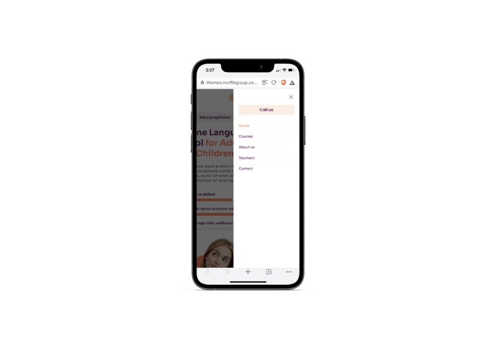
One place where we’ll see this in action is in the navigation design. Take the BeLanguage 4 website as an example:
All of the page links on the regular, non-mobile version of the website can be used. On mobile devices, the button labeled “Call us” can be found at the very top of the list of links that are available. It is displayed at the very end on a personal computer.
When designers review the data they have about user behaviors and goals for the many devices that people use, we will see little alterations in the way that major parts, such as the navigation, are produced.
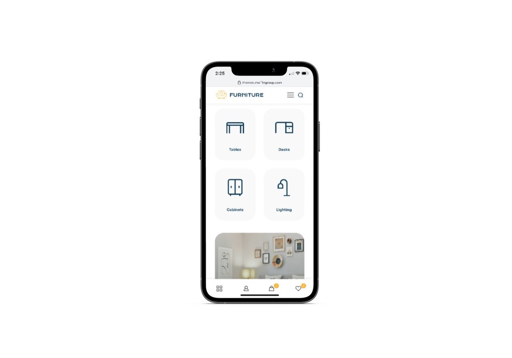
By the year 2023, a growing number of websites will contain capabilities that may be accessed using mobile applications. BeFurnitureStore is responsible for carrying it out. The desktop site’s top bar, which formerly had a multi-level header design and was home to links for the user’s account, shopping cart, and favorites, has been updated to feature a sticky bottom bar instead.
Web designers who reimagine and transform the mobile web experience will be able to position their websites as premium goods in the coming years.
4. Texturization of shape
Skeuomorphism was introduced many years ago, and it has since brought a variety of real-world textures to the screens of our computers and smartphones. However, as soon as people understood that such textured backdrops were distracting and unnecessary, they fell out of vogue, and the trend in design was abandoned.
In spite of this, utilizing digital texturization is not a terrible thought just because a certain trend in web design is no longer popular.
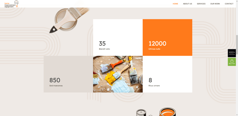
Before the year 2023, web designers will experiment with organic shapes to add textures to their designs that are both subtle and strategically vital. On the website for BeRenovate 5, you might see anything like this as an example:
The background of every page on the website is curved and has rounded edges. They enhance the UI’s visual appeal without taking over the design.
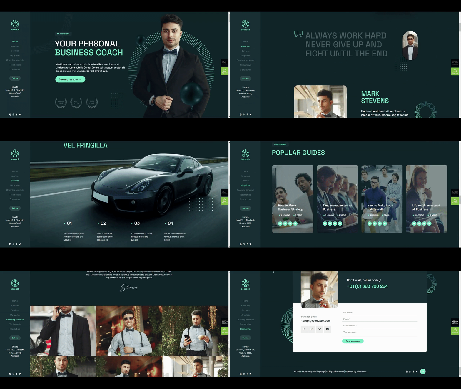
Another choice is to strategically use digital texturing. BeCoaching 3: a good example of how to draw readers’ attention to particular sections of your pages
The website consisting of a single page utilizes two formats throughout its entirety. Because of the uniformity of the texturization, it will be much simpler to draw the attention of visitors in the appropriate direction.
Most of the time, the forms are located nearer to the right margin of the page. These forms ought to improve the amount of content that users view and the amount of content with which they engage, given that users’ eyes are typically drawn to the left border of the screen.
5. Supplemental video
Consumers’ preferences for accessing information online are extremely diverse. Anyone with the time to read anything can benefit from reading blogs. However, vlogs or video blogs would be great for those who prefer to watch or listen instead of read.
The content you provide on your website, however, cannot be supported with video in every instance. To begin, if you aim to provide a specialized method of content consumption, the design may quickly become unmanageable. A website’s loading time can be greatly slowed by the addition of videos due of the massive file sizes that accompany them.
In 2023, designers will only use a video replacement or supplement if doing so is necessary.
On the BeBusiness 6 website, for instance, there is a full-width video area accessible at around the page’s midpoint. It’s impossible to ignore this:
This video segment can be used in a variety of ways. for the purpose of showing video testimonials. to restate all that was said earlier. to provide a brief description of the product’s technical features.
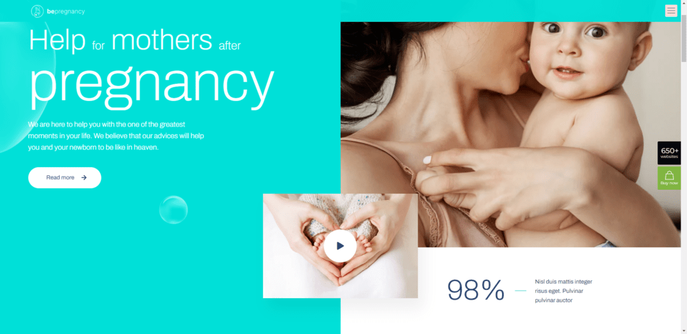
Furthermore, extra footage doesn’t have to take up much room to be helpful. For instance, the video can be found under the BePregnancy hero area, in a small cutout:
Visitors can start watching immediately by clicking the large, flashing “play” button (if they want to). Yet again, this data can be used to many different purposes.
Designers can aid in reducing page load times by using video sparingly and omitting autoplay video backdrops and segments.
What do you think of these design trends for websites?
Many times, lists of web design trends only touch on the most obvious of upcoming shifts in the way websites look and function, such as new color palettes, creative uses of typography, slick animations, and other visual flourishes. By 2023, however, designers will have shifted their attention to trends that will strengthen the web as a whole and encourage more in-depth interactions with users.
Issues of accessibility, responsiveness, and trust formation are intricate. Websites built with BeTheme, however, will feel intuitive because many of the 650+ demo sites provided with the WordPress theme already account for these details.


