Embedding someone else’s product into yours allows you to add functionality to your user experience while saving you a significant amount of time and money. It allows product teams to avoid developing modules and interfaces from scratch, as you rush to get your mobile or web app to market.
However, third-party tools need to be chosen carefully. Third-party tools like embedded analytics bring more versatility and relevance to your mobile and web apps, but function can’t come at the cost of excellent UI/UX design.
It’s taken some time, but today there’s a general agreement that product design, in the form of UI and UX, is just as important as the product function. If the front end is clunky, rigid, and has awkward workflows that don’t feel smooth, customers will reject it even if the functionality is valuable.
Creating apps that make use of third-party tools with excellent UI/UX is a double-ended responsibility. The team building the third-party integrations needs to take best practices into account to make sure that they build tools with enough flexibility for the product designers to adapt them to their context. At the same time, the digital product designer and UI/UX team that’s working on the app needs to integrate the embed in a way that smoothly adds to the user experience.
Here are some design tips for embedded products that will help you improve your UX/UI for the greater good of users and support your app’s chances of success.
Customize Your Branding
Just because you’re using a third-party tool, it doesn’t mean that everyone has to know it. White-labeled embedded products enable you to align every aspect of your app with your branding, including your color schemes, logos and navigational flow.
When users arrive at your app, they expect it to be a clear continuation of your website, brick and mortar store and other branded touchpoints. If they don’t see enough visual evidence of your brand presence, they could grow anxious about phishing attacks and nervous that they’re in some kind of spoofed or hacked version of your app.

Image via Pexels
Customizing embedded tools goes beyond design to include workflows too. It’s advisable to look for third-party tools that follow a similar flow and policy to your home website and other apps.
Be Consistent
Consistency is one of the strongest rules for front end design and UX excellence, which is why it’s often worth the trouble to create a style guide for your brand.
Style guides help you keep to the same naming conventions for every user action, stick to the same programming style, and use the same protocols for labeling. Your third-party embedded tools need to abide by the same requirements as the rest of your app. Without consistency, you end up with confusion, and that’s like a death knell for UI/UX designers.
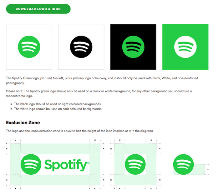
Image via Spotify
If your app’s buttons are usually teal rectangles with rounded edges, except for your third-party implementation of deep link sharing, for example, which has gray square buttons, then you’re introducing friction to the user experience. If you flip-flop between asking users to sign up and register, or have a tab which is sometimes labeled “Save” and sometimes labeled “Archive,” you’ll end up with users who quit your app in confusion because they aren’t sure what to do next.
Choose Tools with Flexible Coding
When you choose third-party embedded tools, look for ones which use APIs, code libraries, and SDKs in a flexible manner so that you can smoothly integrate them into your existing UX flows and visual style.
Third-party tools built in a rigid, unwieldy manner need a lot of coding work before they’ll match your existing workflows, and even then, it’s likely that users will feel the jagged edges. Plus, these tools end up compromising your output and trammeling your freedom to conceptualize, embed and integrate tools in a fluid manner around your app.

Image via DepositPhotos
It’s far better to apply solutions that allow you to implement your changes through a drag-and-drop interface that doesn’t require you to mess about under the hood. Instead, you can easily adjust configurations and tweak settings so that they seamlessly blend with the rest of your app.
Beautiful Design Is More Than Aesthetics
When it comes to product interface design, you know that color choices, fonts and graphical hierarchies are immensely important.
When you aim for a distinctive typographical style, for example, you can express your brand’s personality, make your workflows more navigable, and improve scannability and legibility of your texts.
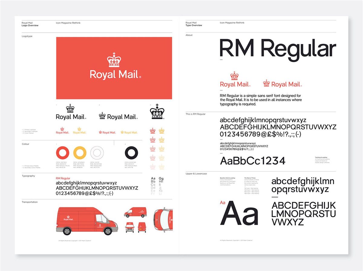
Image via Identity Designed
Color schemes are what make your data dashboards effective and your apps a pleasure to use. Good product design that incorporates embedded elements should have preset color palettes and visual hierarchies that you can choose to match your brand colors without giving users sensory overload or making the content too hard to read.
Focus on the Goal
Finally, it’s vital to be choosy about which embedded products you decide to add to your app. The integrations you select should add value to your platform and improve user experience.
It’s easy to be tempted to add more features simply because “more is more,” but you risk overwhelming your users with too many options which aren’t intrinsic to your core product positioning.
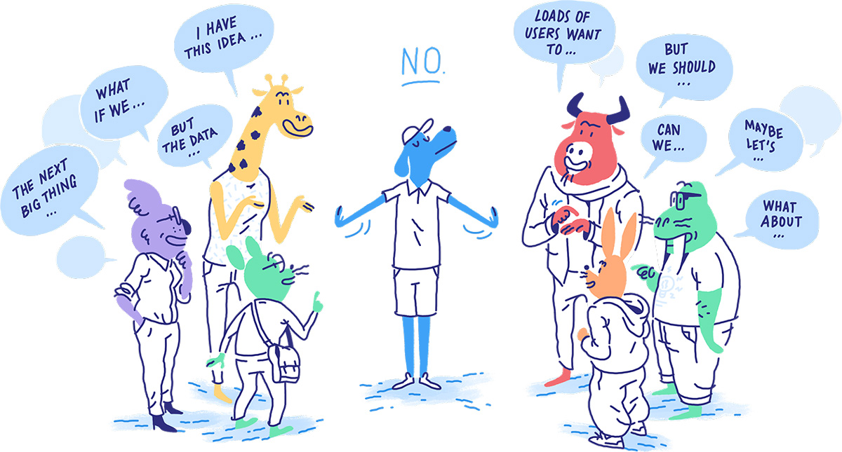
Image via Intercom
The desire to keep up with the competition can be strong, but it’s not a good enough reason to add “just one more” feature. No matter how good it makes you look, if it’s not needed then it’s just more clutter.
Third-Party Tools Should Be Applied with Care
Embedded digital products and third-party tools can speed up the process of developing your app and help enhance the UI/UX that you can offer to your users, but that’s only possible when you keep UI/UX principles at the forefront of your mind at all times.
Choosing tools that are relevant to your app, ensuring they are easy to adjust, and customizing them according to your branding and workflow needs with consistent labeling and design principles can bring you to app nirvana, keeping your users and product team happy.

Author Bio
Gal Shachar is a designer based in Tel Aviv who specializes in digital UX, ad media, and branding. He has been active in the industry since 2017, following his studies at Ruppin College. Since then, Gal has been working with many well-known brands and businesses on web design, logo creation, user experience, and branding campaigns.


