We’re forever on the lookout for powerful and more efficient web design tools together with ways to improve our skills and services. We make conscious efforts to do so, yet for the most part this desire is in the back of our minds, but nevertheless active.
Some like to go with the latest fads. Doing so may work for the short term. In the long term it’s a poor strategy.
If you really want to grow in your web design profession or avocation you need to focus on design trends that have staying power.
Taking on a new trend can at times cause you to stray beyond your comfort zone. Yet what you’re really doing is enabling your website users to become more engaged and at the same time letting them remain in their comfort zones.
It’s not all about you.
Take a few minutes to browse through BeTheme’s library of 500+ pre-built websites. You’ll quickly discover what we mean when we talk about trends that have staying power. Every one of these professionally crafted design aids has it.
Trend #1: Why tend to overkill when sticking to a super minimal navigation approach works so very well
This is a design area where web designers tended to be followers rather than leaders. Mobile devices, and the lack of space that they offered literally pushed designers toward minimalist navigation methods. Desktop applications received a beneficial side effect of these methods. Over time they became easier and easier to navigate.
Just like using fewer words in a sentence to say the same thing, designers were forced to work with less allowable space, use fewer links, and locate them in footers or sidebars resulting in a cleaner design.
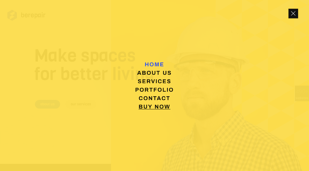
BeRepair is a particularly cool example of this with a navigation menu that’s tucked neatly under the hamburger menu icon.
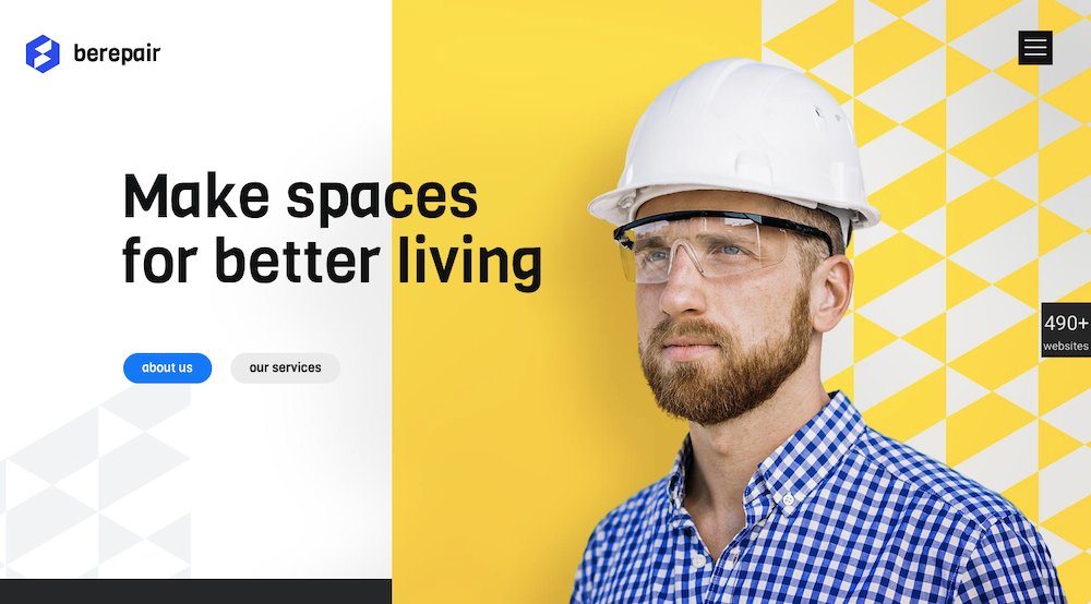
The effect of a less-is-more design trend is particularly noticeable upon opening the pop-out menu that features short, easy-to-navigate links located in a sea of white space.
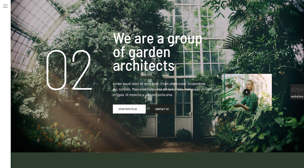
BeGarden, with its non-traditional navigation, also makes excellent use of the minimalist approach. It can be seen in its left-aligned menu.
Trend #2: To really emphasize your message, don’t skimp on white space
Doing more with less can be downright fun once you get the knack of it – which doesn’t take long.
Take videos for example. Brevity rules here also.
The BeWeddingPlanner site shows how you can use simple imagery to effectively tell your brand’s story.
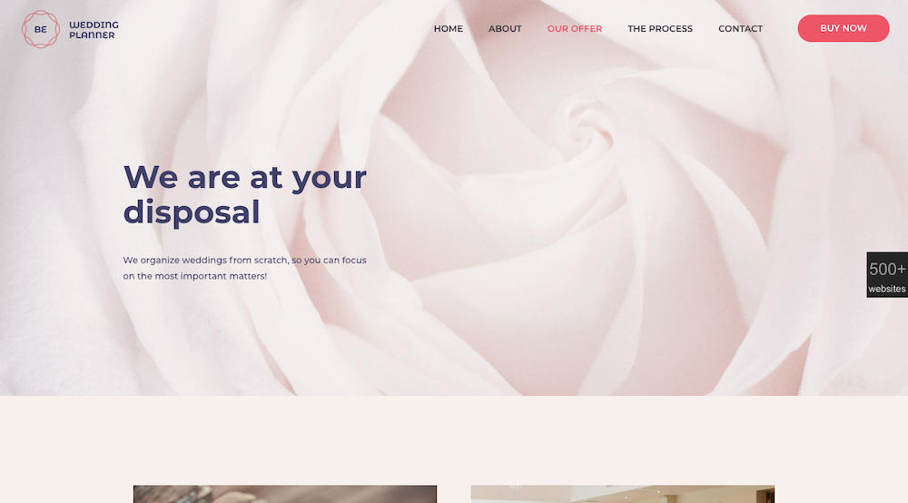
An example where less is indeed more.
Trend #3: Present your visitors with a human face to connect to
Give your website an engaging personality
Adding warmth to your site will always be effective. BeEcoFood does so with a simple, yet lively header.

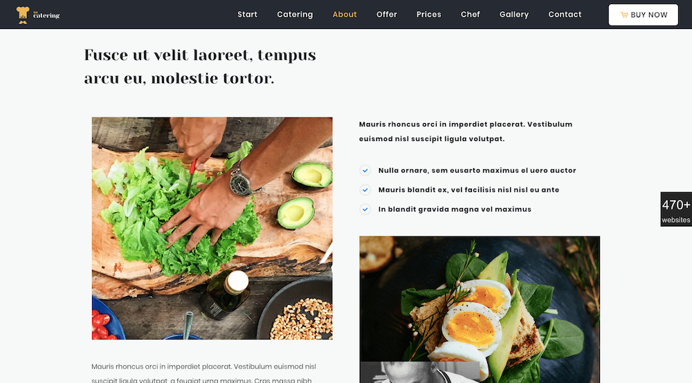
BeCatering gives the impression that the food preparation is happening just for you.
Trend #4: To ensure a harmonious experience make sure you’re using universally-accepted typography
There are fonts out there that are not 100% browser friendly. Using any of them could put a serious crimp in your online success. Sans-serif fonts like Tahoma and Ariea, and serif fonts like Times New Roman are super-safe, but there are plenty of others you can safely use.
Make it a point to verify the fonts you’ve chosen are web safe; like the font like used in BeParty’s animation.
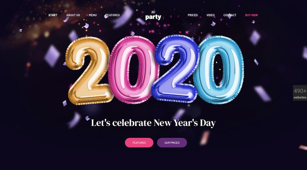
The eye-catching design of BeTheme’s website page is based on a web-safe font, minimal text, a generous use of white space, and engaging imagery.
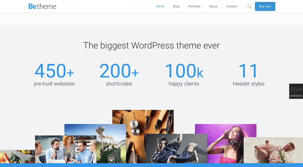
Trend #5: Dark Mode is here to stay – Don’t just accept it; Embrace it
This relatively new design trend is not only popular, it is bound to become even more so. It’s easy on user’s eyes. That’s especially important if these users will, as expected, spend even more time viewing their mobile devices.
In other words, Dark Mode has serious staying power.
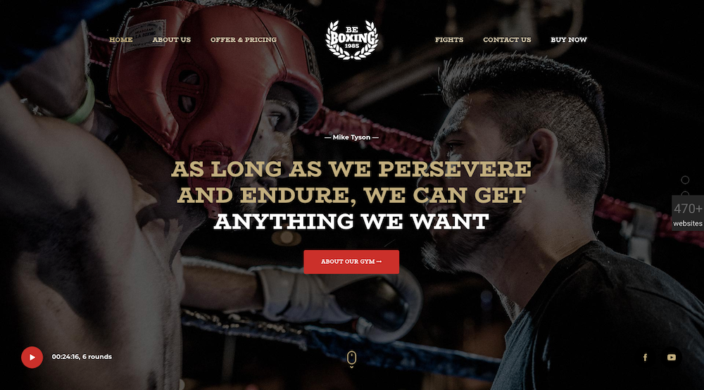
As websites tend to grow darker, good design dictates they do so in the proper contexts – as is the case with BeBoxing’s hero image.
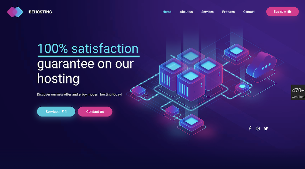
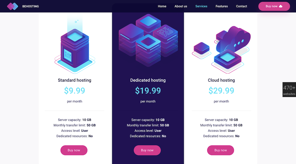
BeHosting cleverly uses the dark mode trend to allow its key messages to dramatically stand out in a delightfully pleasing way.
Which web design trends might you decide to adopt this year?
None of the web design trends discussed here will cause you to waste time and energy making repairs or changes should you suddenly realize your website is swiftly approaching old age and obsolescence. Not a single one of them shows any indication of becoming a passing fad.
For the most part, you should be focusing on those design trends that have plenty of staying power. They won’t be going away any time soon. That will always be the case when you select any of BeTheme’s 500+ pre-built websites to provide a foundation for your web design.


