Perhaps you’ve experienced your share of problems in finding photos for your website. Finding “just the right” photo to support a message can sometimes be a challenge.
May we suggest you give some thought to using illustrations?
They could provide a simple solution to whatever problem you might be facing when it makes sense to use them.
This post will show you why and how.
So, what makes sense?
How do you determine what kind of visual style will appeal to you?
It could be that photographs tend to fit hand in glove with your brand. Still, if you decide to go with an illustrative approach, you have an almost unlimited choice of forms and styles to work with.
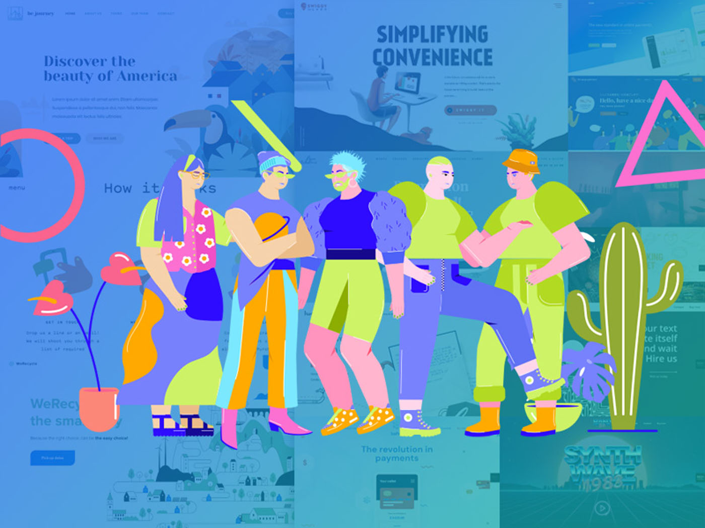
We took that into account when we created many of our pre-built sites for BeTheme. The following examples will give you an idea of the diversity you’ll have at your disposal and can also serve as sources of inspiration.
We’ve also included examples of notable websites that use illustrations to great effect. Take a good close look at all of them as we explore seven reasons why you might want to use illustrations in your website designs.
Reason # 1. When a photograph doesn’t fully capture a complicated subject or message
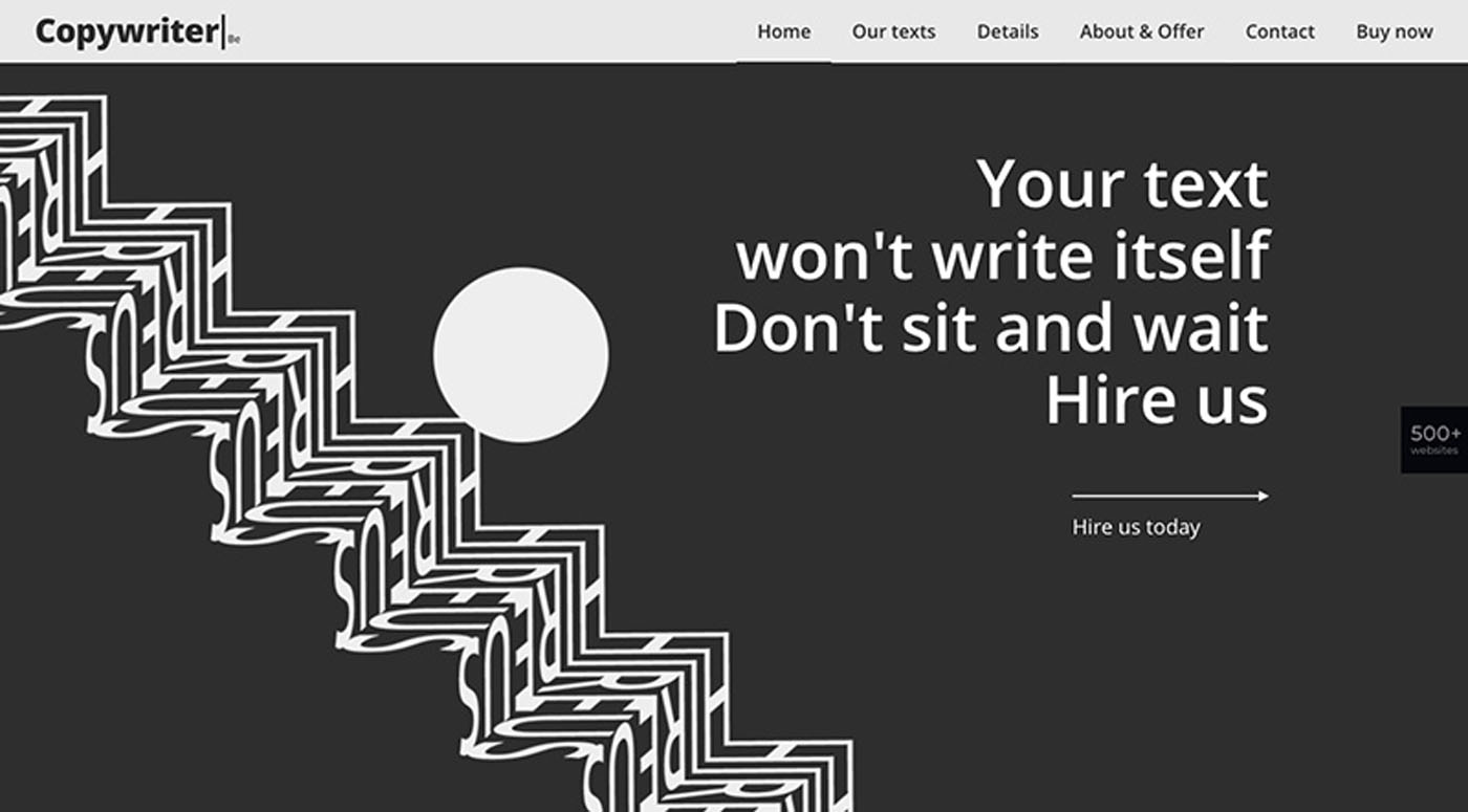
Sometimes, it can be nearly impossible to find a photo that accurately reflects a brand, the reason being that the subject is too complicated to capture in a photo. A professional writer’s website is one example.
Notice how the BeCopywriter 2 pre-built site addresses the subject.
The design is engaging. The text is effective, and the illustrative scheme adds a unique touch.
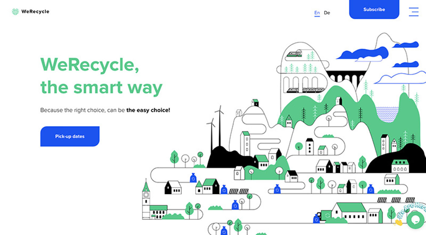
A recycling company website doesn’t generally provide many opportunities for using photos. Illustrations, on the other hand, can be much more effective for this type of site, as this WeRecycle website illustrates.
Consider that it could take a series of photos to tell the story of what this business does, but one or two illustrations can present the full scope of the business’s operations to website visitors.
Reason # 2. When a brand’s rather unique look calls for a unique approach
Every brand has its unique characteristics. If that were not the case, it would be difficult to stand out from the competition. It would also make it more difficult to differentiate between brands.
When a brand’s style is way out there, a web designer may be compelled to follow; in which case traditional web design rules can fall by the wayside.
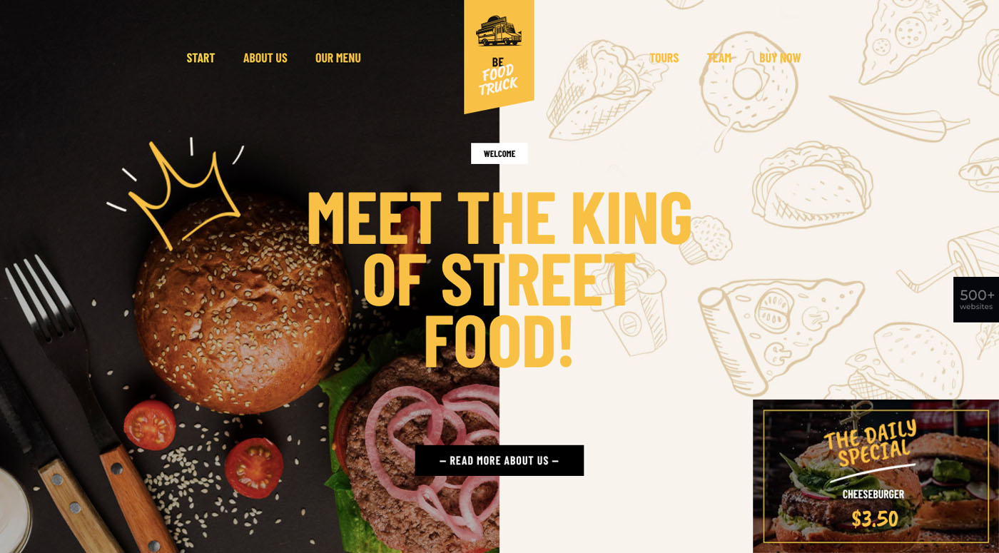
In this case, the answer to the question of whether to use photos versus illustrations might be to use both.
Like BeFoodTruck does so effectively:
While photos may not work well for recycling industry websites, they are a necessity in the food industry. As we’ve just seen, a balance of styles works even better.
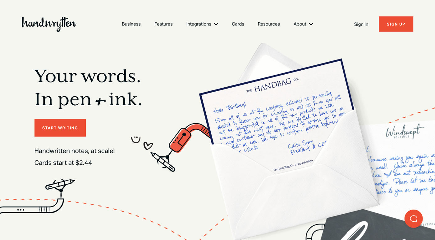
The Handwrytten website uses a similar balance and takes its design a step further by animating the illustrations.
Reason # 3. When a company wants its brand to stand out from conventional photo-strewn websites
For some industries it’s almost a given that its businesses could be expected to have similar looking websites; an example would be the use of a multiplicity of photos for travel and hospitality sites. For some industries, a kind of politically correctness seems to be the rule.
Sometimes a judicious use of illustrations is all it takes to set a website apart.
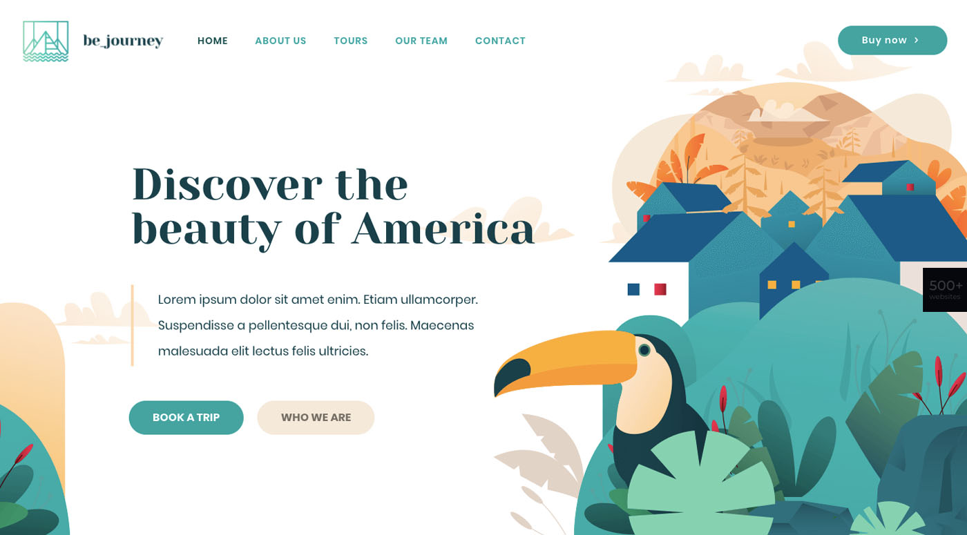
BeJourney2 is a case in point.
The site isn’t photo-free, nor does it need to be. Most of the design does however rely on illustrations and illustrative touches.
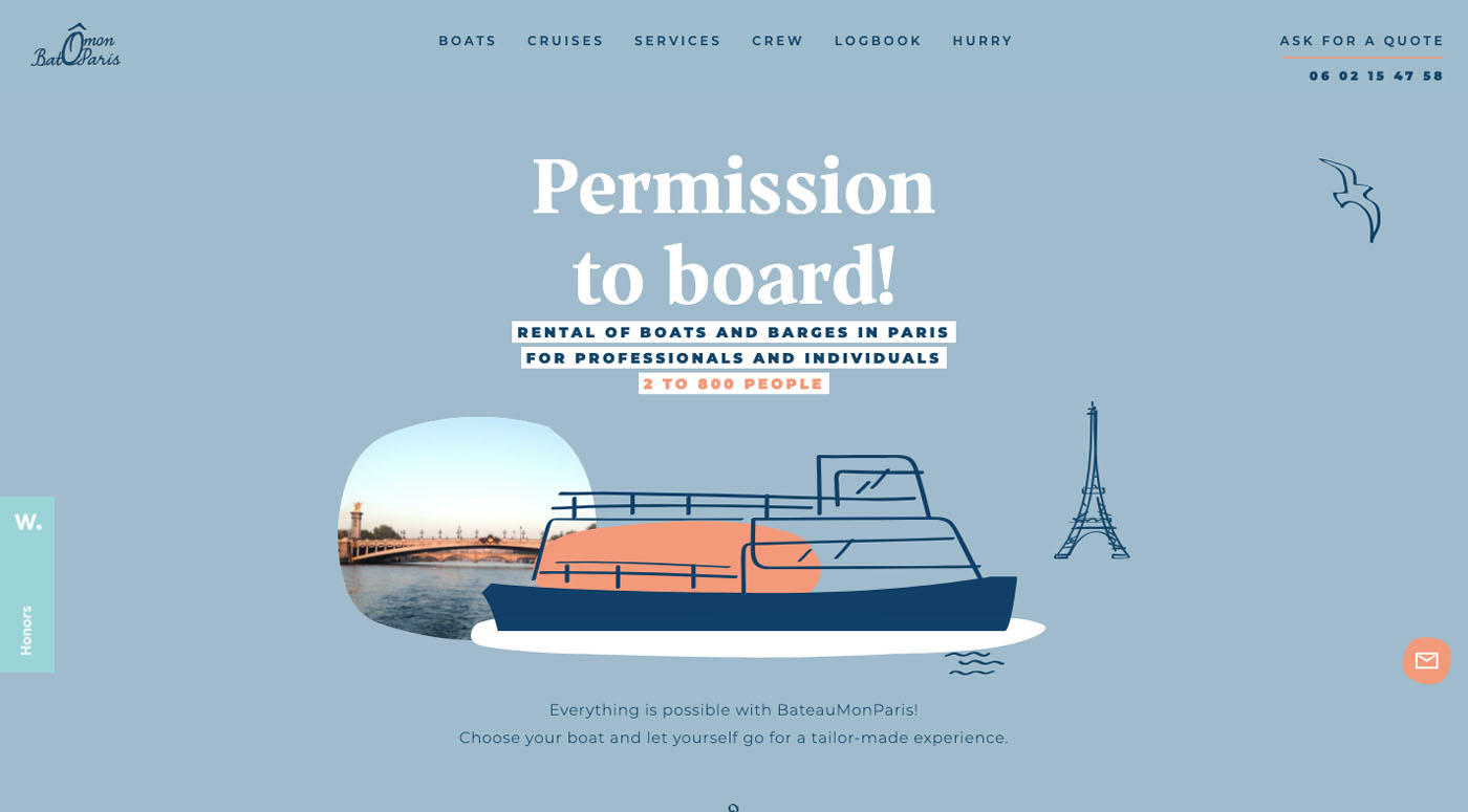
The Bateau Mon Paris boat rental company makes good use of both:
While illustrations dominate, the peekaboo photo definitely has its place.
Reason # 4. When a new company wants to add leverage to the style of a brand that consumers have already placed their trust in
The challenge for the new company is to show that it has a service or product line equal to or better than an established trusted brand. This can be done most effective through the use of a website design that is reminiscent of the established brand, as opposed to one that is radically different.
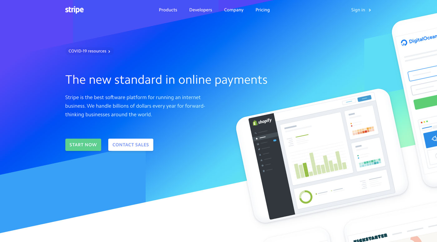
An example of a company’s website design that became a standard for those of similar software companies is Strip’s:
This illustrative style has been put to use by other companies for years (including an effective use of gradients).
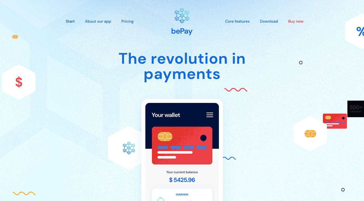
If you look closely, you’ll see that our BePay2 site follows the Stripe example:
It’s worth noting that blue dominates for a reason. Blue is a color that is symbolic of trust and security.
Reason # 5. When a creative type has something interesting to share
Whether you’re talking about yourself or about what you’ve done, illustrations can be a relatively easy way to tell a story, which is really what most creatives are trying to do. When you’ve created something cool, people are usually just as interested in how you went about it as they are in the final result.
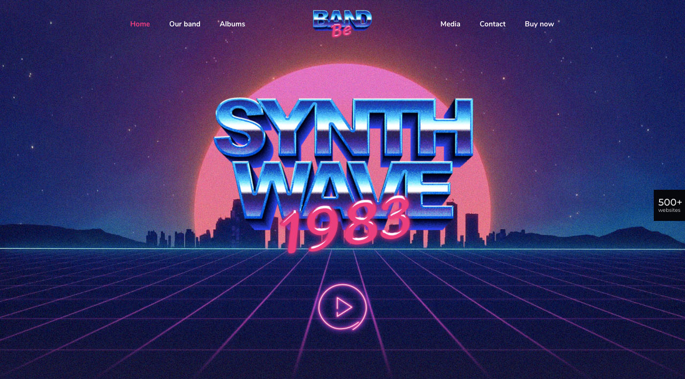
This can be especially true for a small agency or a one-man show that simply doesn’t have the resources to put together what would amount to a photographic production. How would you go about giving your website an 80’s look? The BeBand pre-built site shows just how easy it could be.
Having the band members dress like 80’s rock stars, 20’s jazz players, or whatever, would probably work, but using illustrations is flat out easier and every bit as effective.
Check out what artist Polly Kole has done with respect to building an engaging illustrative website.
While a static design like this would be attractive enough, it just happens that this site is interactive in that it allows visitors to view each work of art from different perspectives.
Reason # 6. When a company’s product is a smart app or a source
The effective use of illustrations to tell a story takes center stage here. If you’re selling a smart app, what you’re really selling is what it can do for the customer. You’re selling a solution or a set of solutions, and that could be difficult if not impossible to depict with a series of photographs.
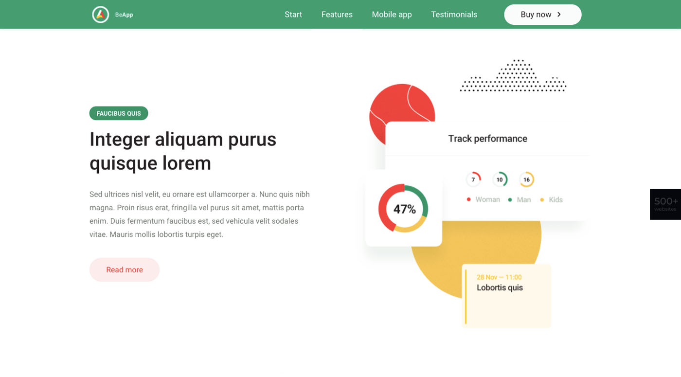
So, you use illustrations, vector graphics in this case, because they can give your website a sense of geometric stability.
BeApp 6 does this in a way that brings the strengths of the app to the fore:
Screenshots can also be used to illustrate how an app works and what it can do, but they are not always a particularly attractive approach.
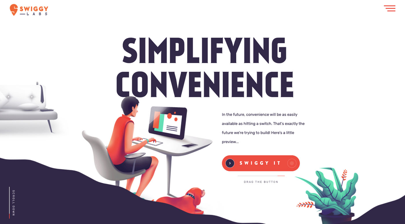
Here’s what Swiggy Labs came up with.
Instead of electing to display the actual product, this website design features a CTA button that invites a visitor to “Swiggy It”. The resulting animations and messages tell the story about the company and its product.
Reason # 7. When a brand’s target audience is children (or, as is often the case, their parents)
Given how comfortable children are with illustrations, cartoons, and apps, they naturally find simple illustrations more relatable to their wants and interests. Another factor to take into account when considering using illustrations is that they can make it much easier for children to understand what could be a complex subject; like learning a language.
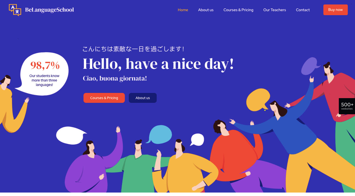
This is how BeLanguage 3 handles the subject:
You don’t need to understand Japanese, Italian, or English to understand what the website or the company behind it is offering. The illustrations tell the story.
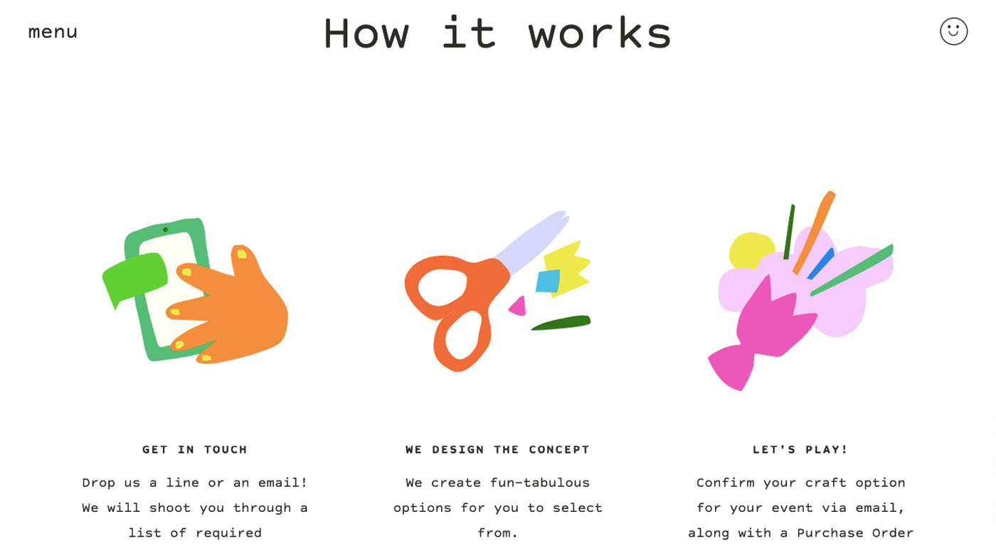
Make Play makes great use of illustrations to put forward and strengthen their sales pitch to kids (and their parents).
This youthful site has fun written all over it. Although the homepage illustrations are static, things get interesting elsewhere when visitors encounter the site’s lighthearted animated graphics.
Are you thinking about using illustrations to style your website?
If your attempts to use photography to tell your brand’s story have proven to be difficult or unsatisfying, graphic illustrations might be the answer. The truth is, whether you investigate BeTheme, look at other sites around the web, or both, you’ll see that illustrated websites are rather common.
Not only that, but they tend to have a unique appeal that catches your attention.
So, if you’re bound and determined to make your website be noticed may we suggest that you experiment with illustrations. It shouldn’t be difficult to come up with a fantastic style of your own.


