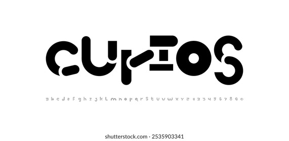
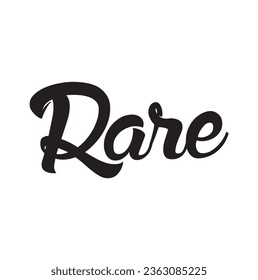
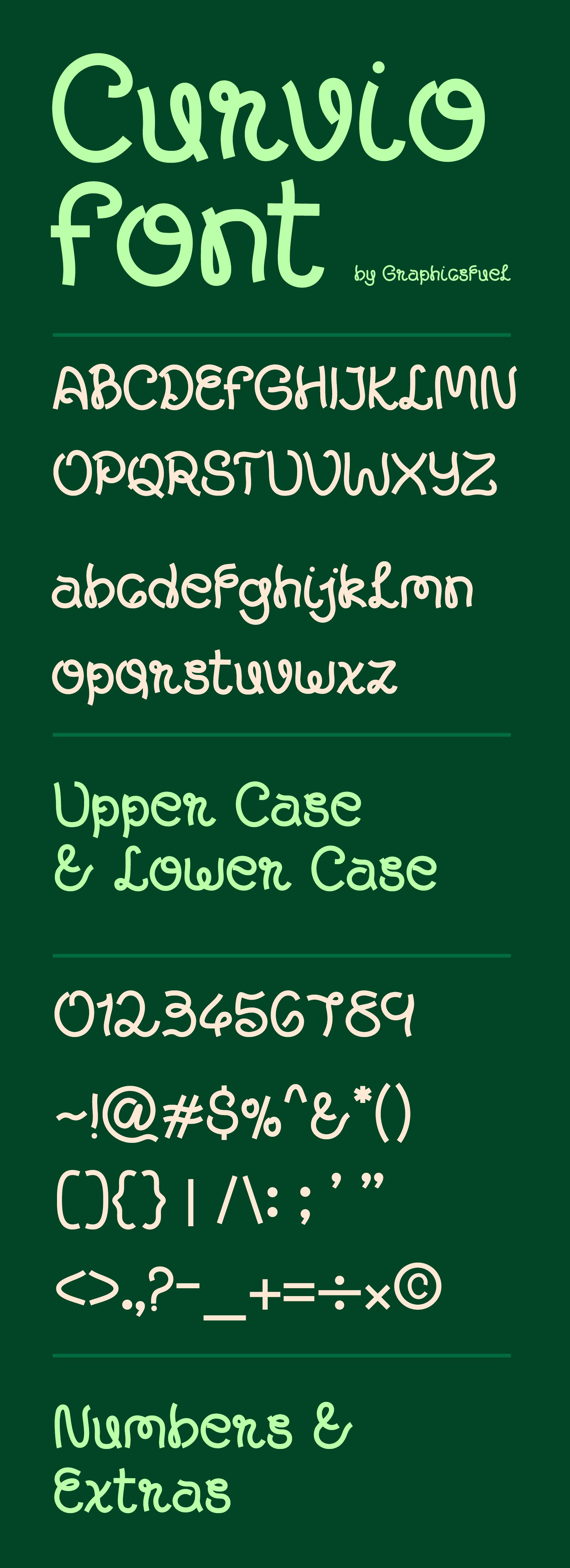
Typography is more than just letters on a page — it’s visual storytelling, a language that speaks volumes. Today, I’m excited to share the journey behind a font called Curvio that defies traditional categorization, a typographic piece that blends well between styles with graceful audacity.
When I set out to create this font, I wasn’t interested in following the well-worn paths of serif, sans-serif, or cursive. Instead, I wanted to craft something that breathed life into text, something that could adapt and transform like a graphic designer’s most sought-after font.
The result? Curvio. A typeface that is simultaneously familiar with the traditional boundaries of typography. Upper and lower cases flow into each other with an organic feel.
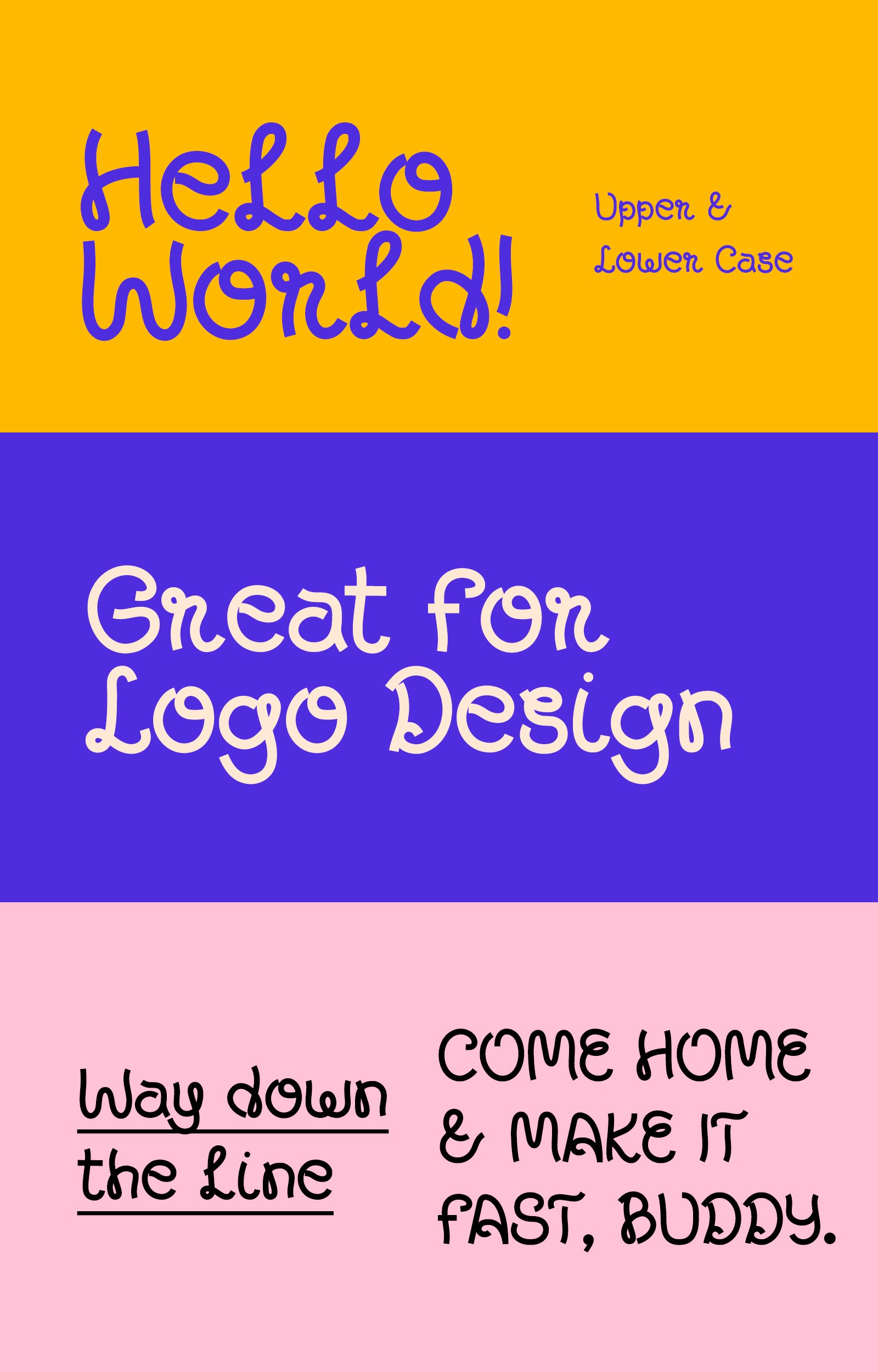
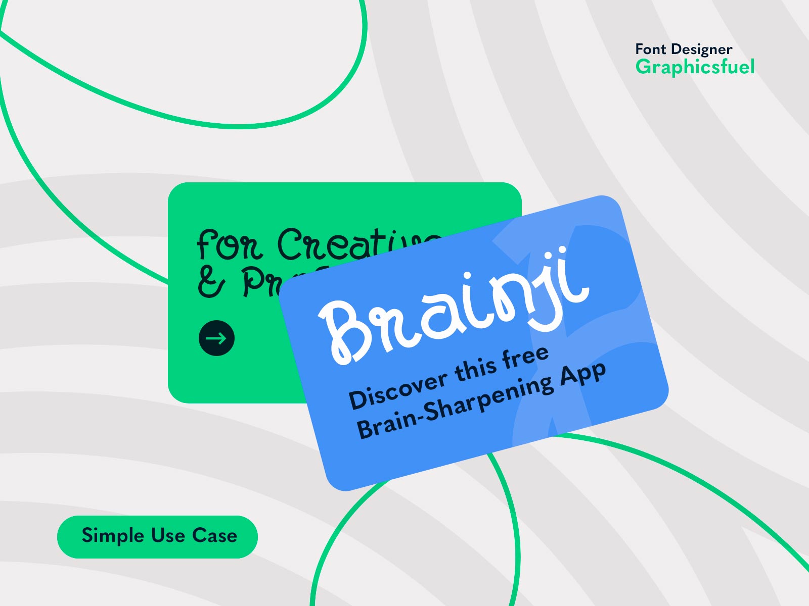
This font isn’t just a collection of characters. It’s a smooth gaze. Primarily focussed on titles, headers, and logotypes, it offers designers a huge level of customization. Imagine a logotype that looks hand-drawn, yet maintains a professional polished look. That’s the magic I’ve tried to capture in this font.
File Format: .OTF
File Size: 0.44 MB


