Have you ever noticed that artists, web designers and photographers like to talk about composition? At the consumer’s end, it may seem that this is some secret knowledge, but in fact, each of us can understand the basic principles of harmonious design, and make a beautiful and compositionally balanced website without any professional help. And this article will help you achieve that.
So, what is composition? In simple terms, it’s an ability to organize elements and unite them into a single whole: be it a picture, a photo, or a website. We will speak about the basics of composition and explain how they work in web design. But what for? To make your site compelling, of course.
Color
Your first and foremost task is to choose the right colors.

Color is considered to be a full element of composition, consequently, the way people perceive your site and product will largely depend on the color scheme you use.
Bright, contrasting colors create an energetic and vigorous atmosphere, while subdued hues and their combinations are perfect for making your readers calm and relaxed. Therefore, when discussing website colors one should think about the emotions he/she wants to trigger, and choose an appropriate palette.
Color accents can also be used to attract attention. For instance, the use of contrasting (complementary) color combinations, like black and white or red vs green will help you to create the most important buttons like “Order” or “Contact Us”.
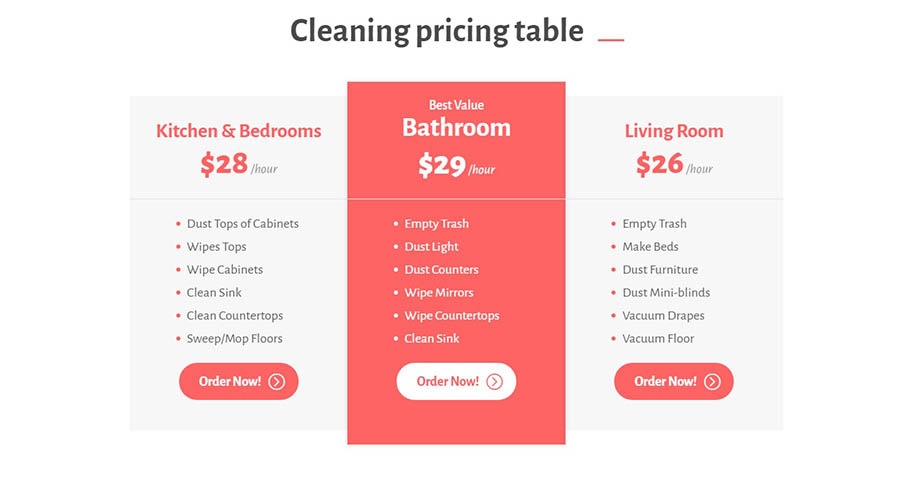
Though, if you have no idea what color scheme and buttons you need, you can select fro ready-made bestselling templates created by theme vendors like TemplateMonster and use them as a basis. Or go to Adobe Color CC website and experiment with colors and their variations.
Rule of Thirds
This principle will help you to position the items in the appropriate places in relation to general proportion rules.
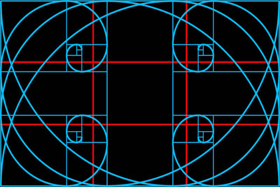
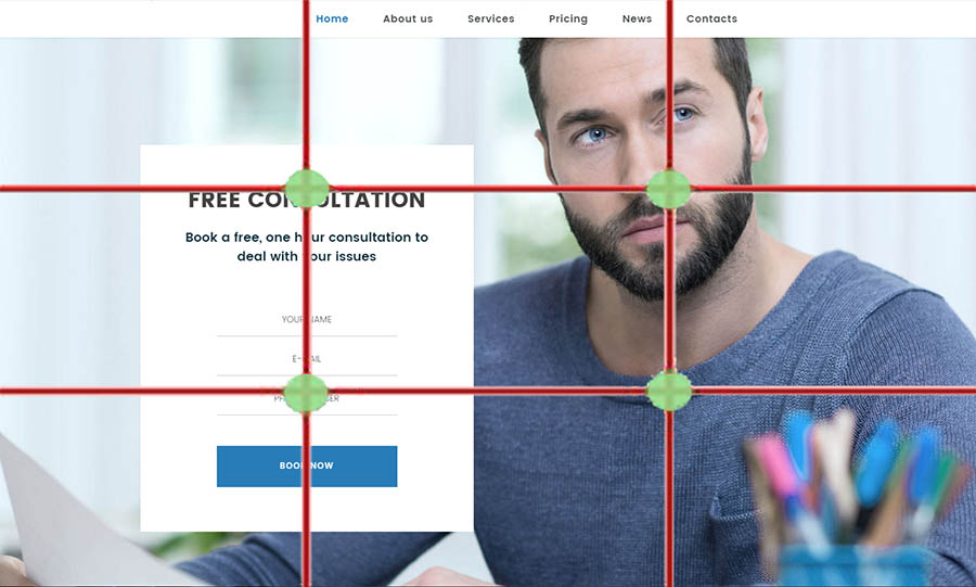
Rule of the thirds is one of the most useful composition techniques. To apply it you should visually divide a page into nine equal parts by drawing two horizontal and two vertical lines. It is commonly assumed that people focus on the points of intersection. It means that all places where the lines have crossed are the most advantageous and would be a great position for placing a photo or a call to action button. It will help you to generate higher conversions and more subscribers.
Space
Your next task is to clear the space and give some “fresh air” to your website.

Do you remember the times when your mom asked you to clean up the mess in your room “because there is no free space”? Sharp’s the word and quick’s the action. Space, or as web designers used to say, the “air”, is a very important composition element. If there is not enough free space on your website, you should remove some unnecessary elements and give up trying to include huge text blocks, pictures and multiple icons. “Air” free space is sometimes much more important than the content. That happens because people do not like cluttered sites that can`t convey a clearly formulated idea and don’t have the opportunity to highlight the most meaningful information.

When creating a website you should first of all think about the message you`d like to share with the world, and limit yourself to a couple of pictures and a short text expressing the idea clearly.
Visual hierarchy
The next thing you should do is ensure that the users focus on the most important content.
A lot of research is devoted to how people view websites. It turns out that they scan the screen top-to-bottom and left-to-right. Remember this fact when you start designing pages, and do not forget that you have a lot of different elements which should be used in full accordance with the rules of visual hierarchy. These are colors and shades, texts and pictures of different sizes, and, of course, lines – vertical, horizontal and diagonal. Believe me, visitors will be happy to follow the path you have suggested and read everything the way you`ve determined – starting from the most important things, and following with the details.

Using this correctly you can lay out information in the most beneficial way. Want clients to push a button? Put it where they look first, and highlight it with a bright color. Want to show the photos of your products? Find the best place for them and make sure that they do not blend into the background.
Feel a surge of creative energy and want to create a perfect website right now? You can do that with cool design portfolio WordPress themes! It’s easy and cheap, and here are the best examples with which to start.
Monstroid2 – Multipurpose WordPress Theme

Details | Demo
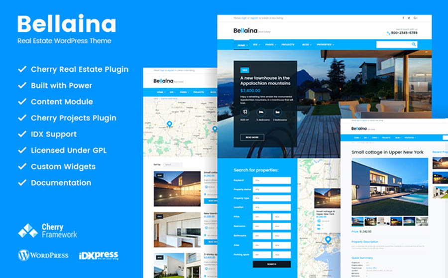
Bellaina – Real Estate WordPress Template
Details | Demo
Stylish Blog WordPress Theme

Details | Demo
Bright and Light WordPress Design

Details | Demo
Professional Photography WordPress Site
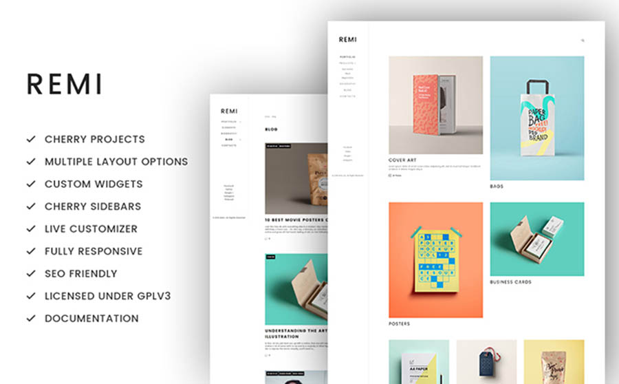
Details | Demo
We hope you have been inspired and are eager to work now! If you like the post or if you have any ideas related to the main principles of composition – feel free to share them in a comment section below. Let`s create perfect designs together!












1 thought on “From Art to Web Design: the Main Principles of Composition by which All Designers Live”
Rafi, I think colors are the most important part of website design! This is where customers decide whether they’ll stick with the business or look somewhere else. You use red, which is what most people prefer. Good job 🙂