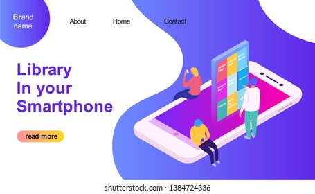
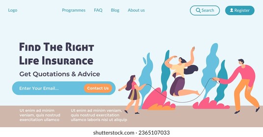
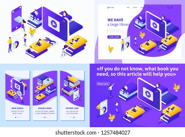
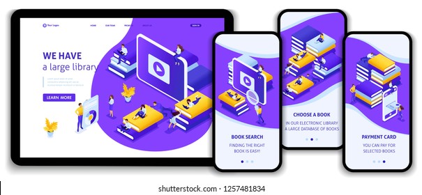
So, your new business venture is finally underway. Your website is up and running, and it’s time to get some leads. Rather than directing potential customers, investors or fans to a cumbersome website, containing multiple pages and heaps of information, it may be best to refer them to a landing page.
Landing pages are the most efficient way of getting your audience to engage. They are simple one-pagers, designed for one outcome. Whether your aim is to sell a product, gain subscribers, or mobilize people for an event, a properly built landing page, funneling viewers to a CTA (call to action), is the best bet for conversions.
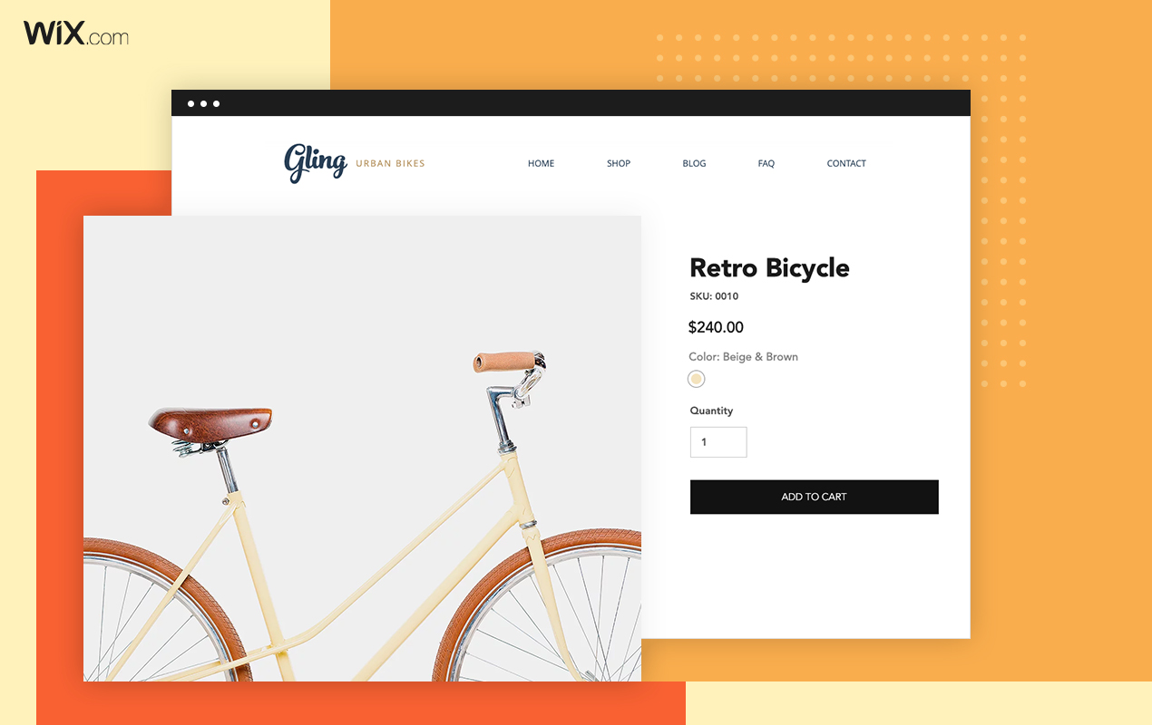
Building a great landing page may sound technical and difficult, but in reality, it’s easier than ever. Website development platforms these days offer a huge variety of templates for any purpose, and landing pages have definitely not been left out. But with so many options, the task of picking the right template to squeeze out the best results out of your landing page, may be pretty daunting.
Here are 10 critical factors to consider when choosing a landing page template:
1. Know your brand

Before diving into a landing page template, it’s important to establish who you are. This is a major part of any business, brand or website. In order to get people to relate, you should have a clear vision of what it is you do, what you stand for and how it should be portrayed conceptually, visually and textually.
Your landing page should be an extension of your brand. But more importantly, it needs to be able to effectively communicate your brand’s message to first timers, as it is most likely to be your first point of contact.
Templates these days are so abundant, varied and focused, that there is most likely a template catering precisely to your field, providing all the necessary tools, tailored specifically for you. Then, you can simply focus on adjusting it to fit your brand identity.
2. Define your goal
A landing page has one goal and one goal only – to get conversions. You may be providing a service, planning an event or building a community, all of which have different audiences and different missions, but they all have a common necessity – encouraging people to interact.
The form in which users are invited to interact is what differs among landing pages. Getting potential customers to purchase a product, may require different stimulation than inviting site visitors to subscribe to a newsletter.
Find out what it is that will most effectively entice your audience, and make sure to pick the template most suited to boasting it on your landing page.
3. Make sure it’s visually appealing
Even the best landing pages are usually viewed very briefly. It’s therefore critical to make it absolutely stunning, or people will simply move along. Images and videos are a great way to get people to linger a little bit longer, increasing your chances of connecting with them, and in turn, getting them to engage.
When looking for templates, make sure to choose one that allows you to easily customize the visuals, while keeping it beautiful, no matter what you choose to highlight.
4. Find the best fitting layout
Layout and structure are some of the basics of web design. They control the flow, how visitors interact, and what actions they eventually perform.
A landing page has its own set of rules. As it is a one-pager, the structure is fairly straightforward, usually containing an enticing header, communicating your message, along with an amazing hero image or video.
It is the layout that can make or break a landing page, so make sure the template you go for abides by these guidelines, or you may find yourself disappointed with the outcome. It’s actually easier than ever, with an endless variety of perfect landing page templates floating around the web.
5. Have a prominent CTA
A CTA, or call-to-action, is the focal point of a landing page. It’s where you’re attempting to funnel your visitors, and it’s what you’ll eventually measure the page’s performance by.
To effectively get people to perform the desired action, the CTA should stand out, demanding to be engaged with. At this point, you should have a clear understanding of what you want viewers to do, and create your CTA accordingly.
Pick a template that provides this feature right off the bat. You shouldn’t have to waste your time creating your own version of what has already been flawlessly built for you. You may want to redirect viewers to another page in order to perform a purchase, or get them to leave contact information for future communication. Either way, the right template should have a spot-on system in place for you.
6 . Keep distractions to a minimum
As previously stated, the mission of a landing page is to extract one single action. This is best achieved with minimalism.
Any clutter on your page is bound to distract visitors from the CTA. You should make sure the message is loud and clear, without providing any excess information which doesn’t assist in getting your audience to perform the one action you have prominently displayed.
Make sure your template has this simplicity built into it, or you may find yourself fighting to de-clutter your page.
7. Minimize scrolling
Landing pages are simple, one-page, one-action designs. In order to most effectively achieve your goal, you want to make sure people receive all relevant information immediately on arrival.
Try to make sure the most important elements are visible straight away, without any unnecessary scrolling. If you find yourself with a long scrollable landing page, you’re most likely providing unnecessary information, muffling your message and distracting from your CTA. Or worse, you may have crucial information go unreached by a large chunk of your visitors!
Most templates these days have this aspect nailed down, so you shouldn’t have to start chopping away at elements in a struggle to tame the page’s length.
8. Make it shareable
In order to get newcomers to your landing page, you’ll most likely be utilizing social media. You should avoid creating a landing page on a platform that lacks in the social media department.
Simple, easily accessed, social media share buttons are critical to spread the word and increase traffic. Having social media options on your page also increases the perceived trust of your brand, so don’t take them lightly.
9. Choose a reliable platform
Fast performance and minimal downtime are a must for modern web pages. Any mishaps in the technical performance of a landing page are bound to result in a loss of conversions.
It is very important to work with a website provider with a positive track record, great customer support and uncompromising reliability. Losing business due to lacking performance of service providers is devastating, and you definitely don’t want to have to deal with that.
10. Utilize additional web tools
Creating PPC ad campaigns, tweaking SEO settings and analyzing page performance are considered basic tools for a modern business.
You should make sure to build your landing page using a platform that provides easy access to these tools, in order to maximize your reach and efficiency.


