In 2022, many people are looking to design their first website. It could be that you have a passion for cooking and want to create an outstanding blog that provides guides on how to create your favorite recipes for the world to enjoy. Conversely, you may be a young entrepreneur looking to create a start-up company that operates online and satisfies a niche in the marketplace that is not currently fulfilled.
Many people who are new to the world of web design have a certain degree of trepidation in making their first site. The common misconception is that you need to be a genius coder to make a professional looking website. This is simply not the case as it is easy to access web design software that is suitable for people of any skill level to create outstanding websites.
This article explains three top tips for creating your first website.
Have a clear plan

- Image Source: Unsplash
Before you start any web creation project it is vitally important that you fully understand what the purpose of the website is. If you are creating a blog site, then your aim is to inspire and educate people and the style and theme of the site should appeal to both the subject you are writing about and the intended target audience. Conversely, if you are setting up an online business the style and features of the site should be tailored to the target market whilst also projecting a business-like image with consistent branding and logo design across the pages.
Take the time to sit down and fully understand the purpose of your site. Next, start to plan out some of the key pages that capture the content you wish to include. In short, having a clear aim of what you want to achieve in your website is the first step to creating a consistent theme for it—and there is a range of both free and paid for web design software that can help you choose.
Look to other sites for inspiration
- Image Source: Unsplash
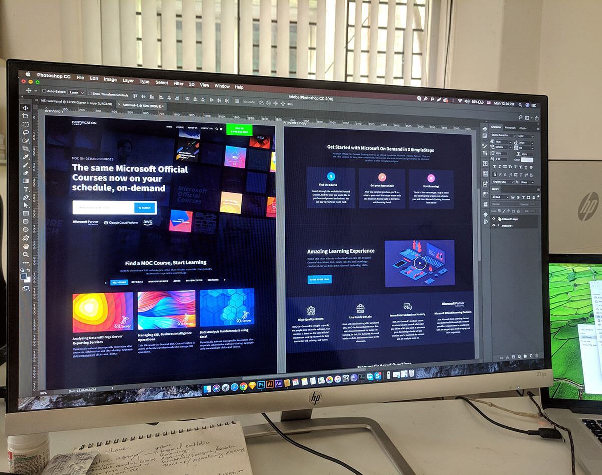
When you are certain on the overall theme and content for your web pages the next step is to compare other websites that have a similar purpose. Look at the features of their site, and how accessible and easy to read they are on several different devices. Write a list of what you find appealing and what features can be improved. For example, if you are considering designing a site that focuses on cryptocurrency and NFT trading there are some excellent sites that present complex information in an easy-to-read format such as okx.com.
Sites for cryptocurrency often contain a range of plugins and widgets that allow the user to gain key information such as currency conversion rates and live values for share prices. Comparing such sites can allow you to create a clean looking site with the right balance between showing complex information in an easy-to-read format.
Focus on the page layout
- Image Source: Unsplash
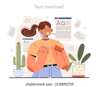
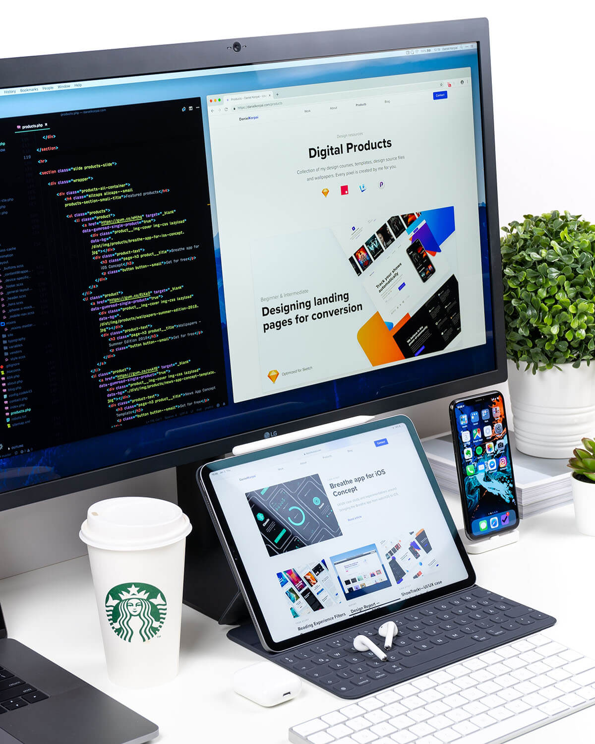
When you have found inspiration on what content to include on your site, the next step is to focus in detail on the web page layouts. Every page should be informative but must not overwhelm the reader with too much information. It is far better to use open space wisely across all your webpages as this can make for a more enjoyable reading experience. Also consider the typeface and fonts that you will use. Ideally, they should remain consistent across all the webpages and should be of a style that fits with your target audience, whilst being easy to read on smaller screens such as smartphones. Finally, consider the navigation buttons the take the reader from page to page. Are they easy to access and is page scrolling kept at a minimum?


